đ
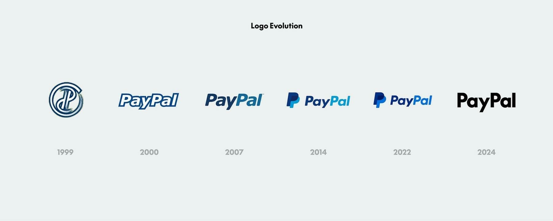
Roughly 25 years after it launched payment processing, PayPal is âushering in a new era for customersâ with some generic black text. The company has a new logo, designed by Pentagram, that looks incredibly plain â especially compared to previous iterations of the logo that featured a rakish slant, two shades of blue, and prominent PayPal Pâs.
Yikes. Really lost all its flavor and personality here. I wonder when this trend will turn around.
@alexandra Probably so! Iâd have given them a better price. đ
The actual graphic version of the logo looks pretty nice on their web site. They shouldâve kept the color in the text-only version, though.
I was going to try and outbid you đ @alexandra
I like the 2007 version better. I only use PayPal when itâs the only way.
Hope they didnât pay too much for this brand refresh. If itâs a logo that I can design⌠đ
WTF, itâs not a logoâŚitâs a bunch of letters tied together into a⌠word. đ¤Śđťââď¸