Jarrod Blundy
@jarrod
Photos
Replies
Reading
Search
HeyDingus ↗️
Archive
Stats
Feeds
@jarrod
Photos
Replies
Reading
Search
HeyDingus ↗️
Archive
Stats
Feeds
2025-09-24
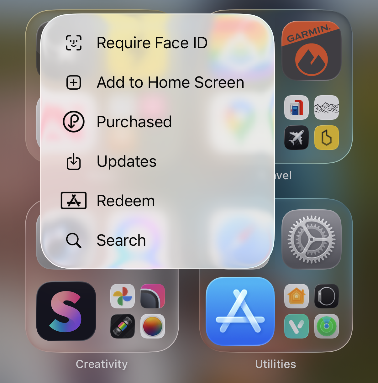
What’s happening with the sizes of these icons in this context menu??
Reply with
⭐ Social
Email
👋
Read other posts
←
→
 Jarrod Blundy