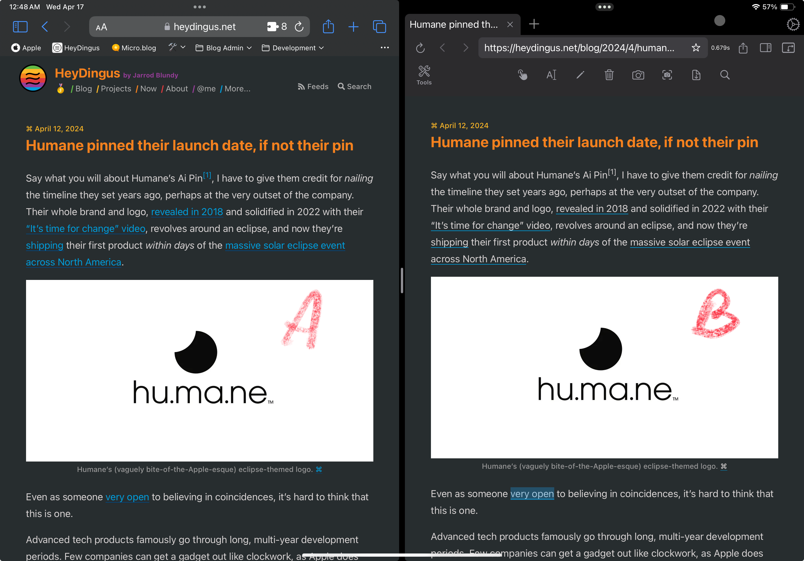
Since the first design of my site, I’ve stuck with blue text for my hyperlinks because that always seemed canonical with the web. Links = blue text, blue underline. But I’ve grown less certain with its readability with all that blue text interspersed. I’m considering a change. What do y’all think?
Read other posts
(I’d add the blue color back to small elements like the footnoes and the ⌘ symbol.)
I kind of liked the blue links. But it makes it more chaotic to look at. Do the links in B have a hover effect and turn blue when you mouse over them? Not that this helps on mobile devices.
@V_ I was thinking just leave the rainbow gradient underline as the hover effect, but adding the blue text back could work too.
@jarrod @V_ jumping in here just to say that I think this works? 😄 That seems neat haha
I don't know if you want to hear this but when I see a light-on-dark web site I always use the reader view. Why? Simply because my eyes can't handle light-on-dark, for some reason I see stripes everywhere when I've read text on light-on-dark (lasts 2-15 minutes). I had to stop using a forum where it wasn't possible to use dark-on-light.
you could have a look at the blue colour to make it brighter if you want to keep the blue. The right one looks like a calmer reading experience.
Here's something you could consider: Blue underline and blue text - but not at the same time. (You do lose the cool gradient, though...)
Edit:Here’s what I did, btw:I made the underline-thickness 1.5px and var(--blue) normally, and added
transition: all ease-in-out 0.2s;
.Then, on the hover state, I made the underline var(--darkGray) and the text var(--blue). However, if you were to implement this, I’d make the text a slightly lighter blue, as the same blue looks a bit darker than what the underline was IMO.
I like it!
@jemostrom That’s fair! A light mode isn’t in the scope at the moment, but it’s something I’m considering for the next major redesign.
@Havn This looks nice, but I’ve become quite partial to the gradient on hover…
I wonder if it looked darker cause I also put a .8 opacity on hover.
Thanks for sharing how you did it! Bookmarking…
Is this something..? 🤔
(I think I now how to fix the blinking on the way out - but I didn’t bother now. 😛)
@jarrod A lot better. I think blue on black is actually a bit of a readability issue.
@Havn Oh man, now you’re speaking my language. 😍 How did you do that?
Oh, the fix for the blink was actually easier than I thought! So while I’m writing how you can do it, here’s a tease in the meantime: 😎
As I wrote yesterday about not posting, I felt the need to make the instructions a quick blog post!
@Havn always smart to follow your own advice! 🫡 can’t wait to take a look, thank you!!