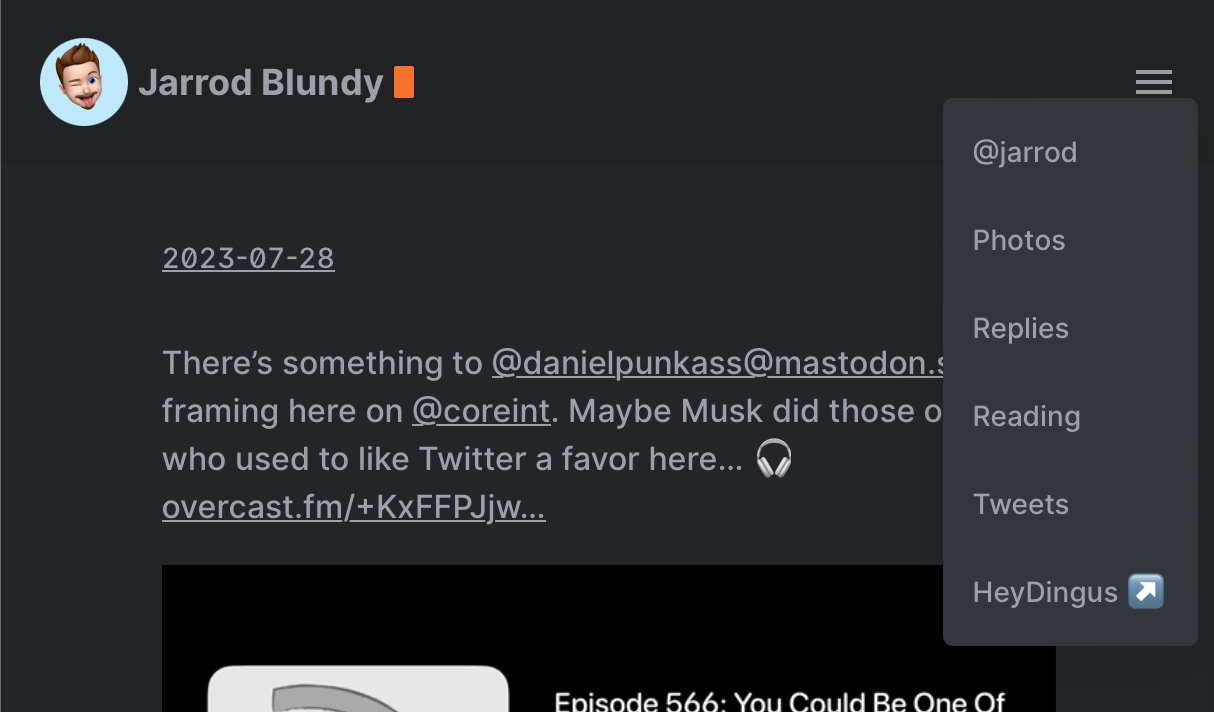
I’d really prefer for my header menu to not have this weird in-between phase where the items make a second row.
If the window is too narrow for them to be on one row, I just want it to collapse into this hamburger dropdown. Any CSS magicians out there who can help me out?
@kq That’s what I thought, and tried to do, but I haven’t been able to track down the right place or incantation to make it so. 😓 I’m using the Hello theme that I’ve lightly tweaked.
@kq I want to say at around 684 pixels wide. But you have to tap on the menu icon to see them displayed.
@kq Here’s an example: share.heydingus.net/QRg1dQcz Below 684 pixels wide, it shrinks to the dropdown menu. Between 684px and 730px, the menu items are hidden behind a click on the button, but they do not live in the dropdown menu. Above 730px, they correctly live in the top nav bar.
@kq That’s super kind of you! 🙂
@kq Fair enough, thanks for taking a look. I had a feeling it had to do with all the cruft. I’ll have to see if I can find some time to pull it apart and simplify.
Thanks again!
@pimoore @kq Agreed 100%. Any design/theme I make for any reason avoids media queries and breakpoints (and any scripts that go along with those) as much as possible. With relative sizing and such, it’s possible to achieve the same results much more elegantly.
@Mtt Relative sizing without media queries? You have my attention!
Well, my personal favorite example is Tiny Theme. 😬 It has only 1 media query (for dark mode only), no breakpoints, no scripts, etc. You can manipulate the entire size of almost everything simply by adjusting one font size.
@pimoore There are definitely ways of doing it. You can use things like
vw
andclamp
, for example. I would consider those quite advanced though. They often require lots of math andcalc
usage.Having said that, there is nothing inherently wrong with media queries. The issues, in my opinion, are:
They are often over used. When one design has multiple breakpoints for different things, it gets to be a mess fast.
It makes things like themes hard to customize. In many cases, you are required to make the same change across every media query.
There are no hard and fast sizes for proper media queries. There will always be one more screen size that doesn’t quite work exactly right.
When used right, they’re great. They don’t slow down load times or anything like that. Use them if you need, just be judicious about them.
@pimoore @Mtt I keep the breakpoints to minimum, but can never get rid of them. I mainly use it to hide some elements on smaller displays. As Pete said, even I want to understand this better. I generally want to improve my CSS skills.
@pimoore And sometimes they are the best possible tool. For example, I’ve got a gallery plugin coming this week that makes use of them. Still no scripts though!
@amit @pimoore Often times that’s the best you can do. And if you’re developing a theme, you could make the argument that media queries are actually easier on customizers than the complicated math centric alternatives.
@pimoore Nice, filing this away for future projects. @Mtt @amit
@Mtt 👀😉