@rscottjones That’s pretty sweet. So it’d show photos taken along a route during a hike, for example?
@jarrod I expect every app will be similarly conversational in the near future. And that’s a good thing, IMO.
@simonbc I kinda like the other way better. This format kinda makes it feel like a social media post, rather than something that’s yours. But not a big deal either way. 🙂
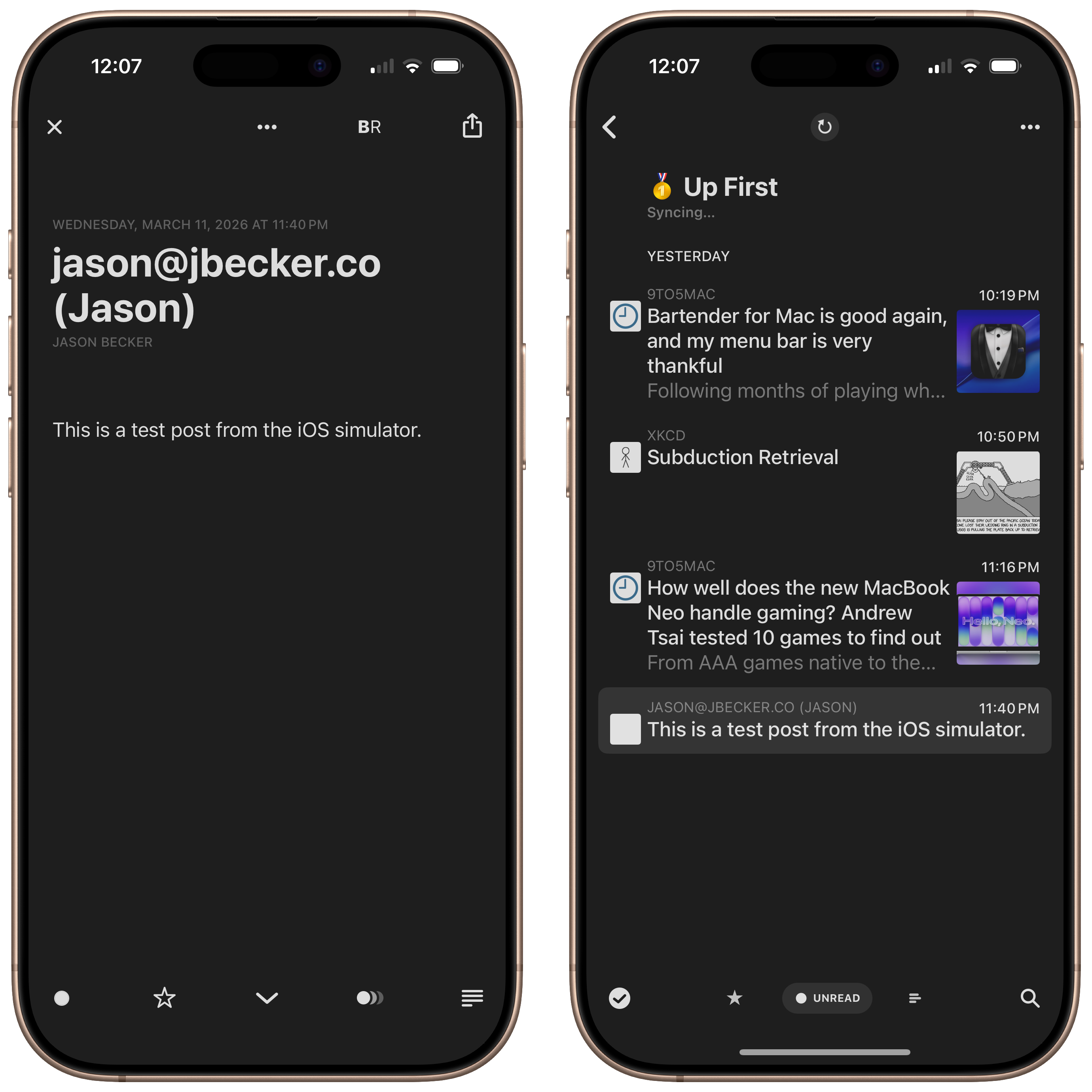
@jsonbecker Btw, this is how your RSS feed appears in Reeder via Feedly

@jsonbecker Simulated successfully. 🫡
@relay @imyke I second that recommendation for the new Mumford & Sons album! The song featuring Gracie Abrams is so beautiful. I’m obsessed.
@mcn 🤞
@numericcitizen I’ve been contemplating the same thing. I want to try to merge my HeyDingus site with my MB one, and sort of merge the themes too. If you give it a shot, keep us updated!
@johnvoorhees Oooh yes please! You know how Omnivore used a different voice for blockquoted text? I loved that and wish every text-to-speech service did it.
@stephenrobles Too bad you can’t power the laptop with the A19 Pro in the monitor! 😂 Looking forward to hearing your thoughts. The XDR might be a splurge purchase for me this year…
@viticci My iPhone 17 Pro erased all my shortcuts from the Share Sheet. Honestly, turned out to be a blessing to start fresh on what was listed there. 😅
@jarrod Update: Grammarly is canceling its gross ‘Expert Review’ that used real writers’ names for its AI editor feature. Here’s the quote via The Verge:
> “After careful consideration, we have decided to disable Expert Review as we reimagine the feature to make it more useful for users, while giving experts real control over how they want to be represented — or not represented at all,” Ailian Gan, Superhuman’s director of product management, said in a statement to The Verge. “Based on the feedback we’ve received, we clearly missed the mark. We are sorry and will do things differently going forward.”
@jonathanreed 👍 thanks!
@gregmorris That super sucks. But the training is still with you!
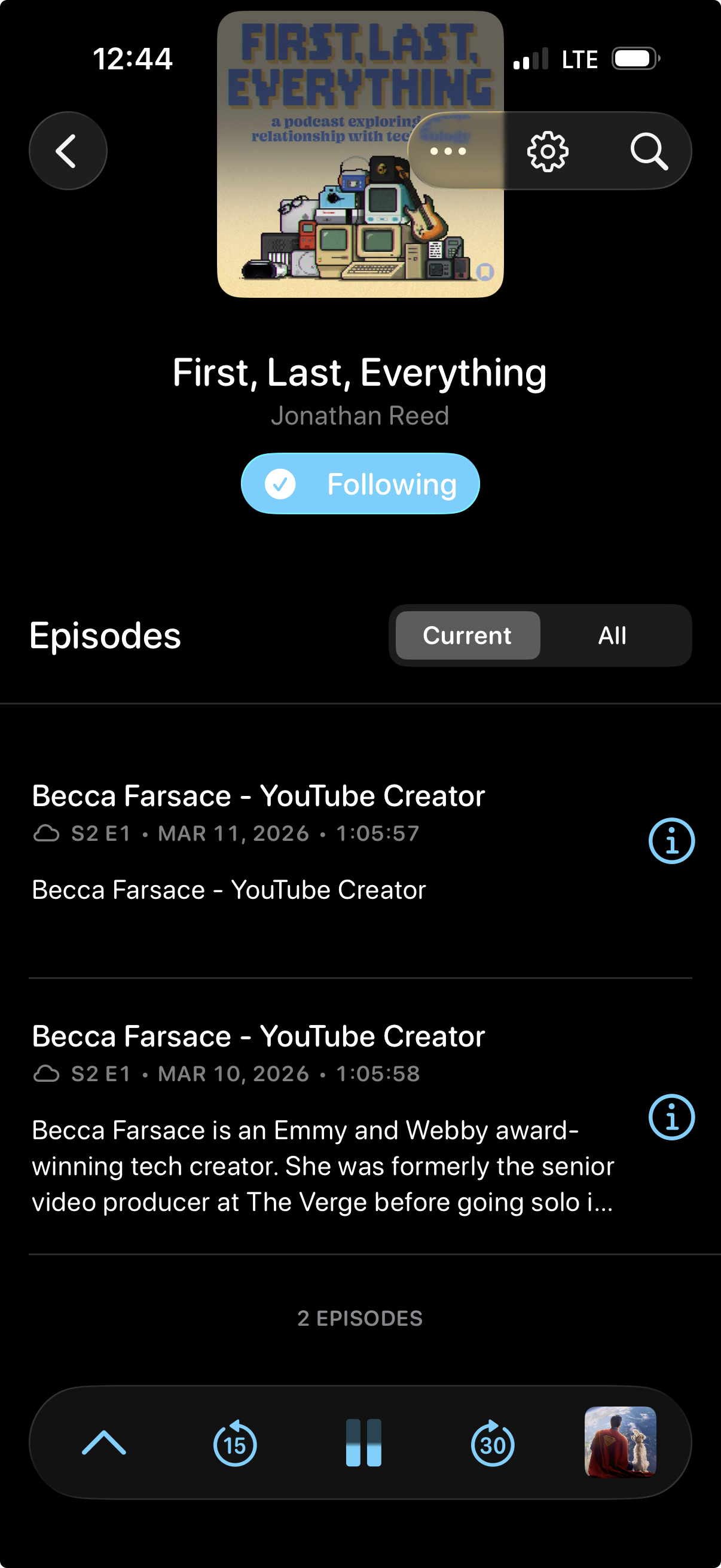
@imthaz It’s Apple Podcasts! I actually use Overcast for all my listening, but the captions in Apple Podcasts are easy to search/line up and capture with screen recording.
@jarrod cc: @stephenrobles, the charger guru himself. 🙏
@birming Thanks!
@jarrod Also, I’ve got to say, I love the old-school notch-less look of the Neo’s display. I’d go back to a larger bezel to be rid of the notch on MacBooks, personally. Maybe the rumored Dynamic Island would be better, but notch-less is just so clean. 👌
@jarrod A few examples…
“Badlands” by Mumford & Sons & Gracie Abrams: https://song.link/us/i/1848218132
“I Think I Like You” by The Band CAMINO: https://song.link/us/i/1572521492
“Angel of the Airwaves” by All Night Boogie Band: https://album.link/us/i/1699090663
(Bangers, btw.)
@BasicAppleGuy My kitchen one was doing that overnight… and then we realized it was a mouse walking over the top and activating it. 🐭
@johnvoorhees 👌 Nice. My original is still rolling, as is the eBay one I got a couple years ago. Stereo paired to my Apple TV and have been supplying all our TV audio for years!
@tylerknowsnothing Yes, totally agree. Just thought it was an interesting observation. Neo’s not technically the first one. 😜

