Sometimes I just have to get a blog post out of my head. Last night it was this one. It was late, and I was tired. Still, I was compelled to roll out of bed, grab my iPad, sit on the toilet seat lid, and let the words flow from my mind to yours through this letter to the world.
Be the one — of many.
Instead of doomscrolling today, I went outside with the dog and sunk my anxious energy into splitting a whole bunch of wood, and started listening to Endurance (the Shackleton book). Then my wife and I went for a walk. Getting away from current events was good for the soul. 📷


Special Counsel Jack Smith is reportedly in talks with officials at the Department of Justice to “wind down” his two prosecutions of President-elect Donald Trump; one over January 6, and the other over his retention of classified documents from his first term.
At issue, per NBC, is the long-standing DOJ policy we became so familiar with in Donald Trump’s first term: that a sitting president cannot be prosecuted.
Our justice system simply cannot be allowed to move this slowly. Otherwise, what even is the point?
There are some days that this button really frustrates me, not being able to read back through all the posts I may have missed. Today is not one of those days.

Congratulations President Trump on your victory! We look forward to engaging with you and your administration to help make sure the United States continues to lead with and be fueled by ingenuity, innovation, and creativity.
I understand why he would 💋🍑 but still, it leaves me disappointed.
Same 😔
I was trying to come up with some clever thing to toot but I just have no words. I'm upset, angry, and scared.
Chris Coiyer: Email for Newborns | Email is good.
I’ve heard of people picking up a decent @gmail.com email address for their newborn child. […]
Me, I’d get a domain name before anything else.
If you get the email address, another cute idea is to write them emails every once in a while, then when you give them the email address, the inbox will be filled with letters from you over the years.
I love the idea to write them little notes and letters before handing over the email address. How sweet. Oh, and just set up an email address with the domain you got them!
Apple News:
Another popular-vote update: It’s mostly the same. Trump is still leading Harris by around 5 million votes, with about 4 percentage points between them. Trump has made resounding leaps among large swaths of the electorate and is on track to get a wider margin than his 2016 win.
😔 wtaf
Just in case you need some lighthearted election thing to allow you to sleep tonight (🙋♂️), this did the trick. Thank you The Onion. 😂
I’m unplugging, taking some melatonin, and hitting the hay. Will check back in the status of “the free world” in the morning. Good luck, US of A. 🤞🫡
Whelp. I refuse to be distraught until it’s officially called, but suffice to say I’m wildly disappointed in so many—a bit over half, it seems—of my fellow citizens for refusing to see what’s in front of their eyes: a man who threatens our right to vote at all—you know, the whole point of the USA. 💔
Maybe kicking off Onward Mountain Guides' Instagram page on election night wasn’t the best idea. But at least it’s out there now. 🤷♂️ If you want to watch me try to be more social-savvy, or keep up with my adventures, give it a follow! I’d be just tickled. 🫶
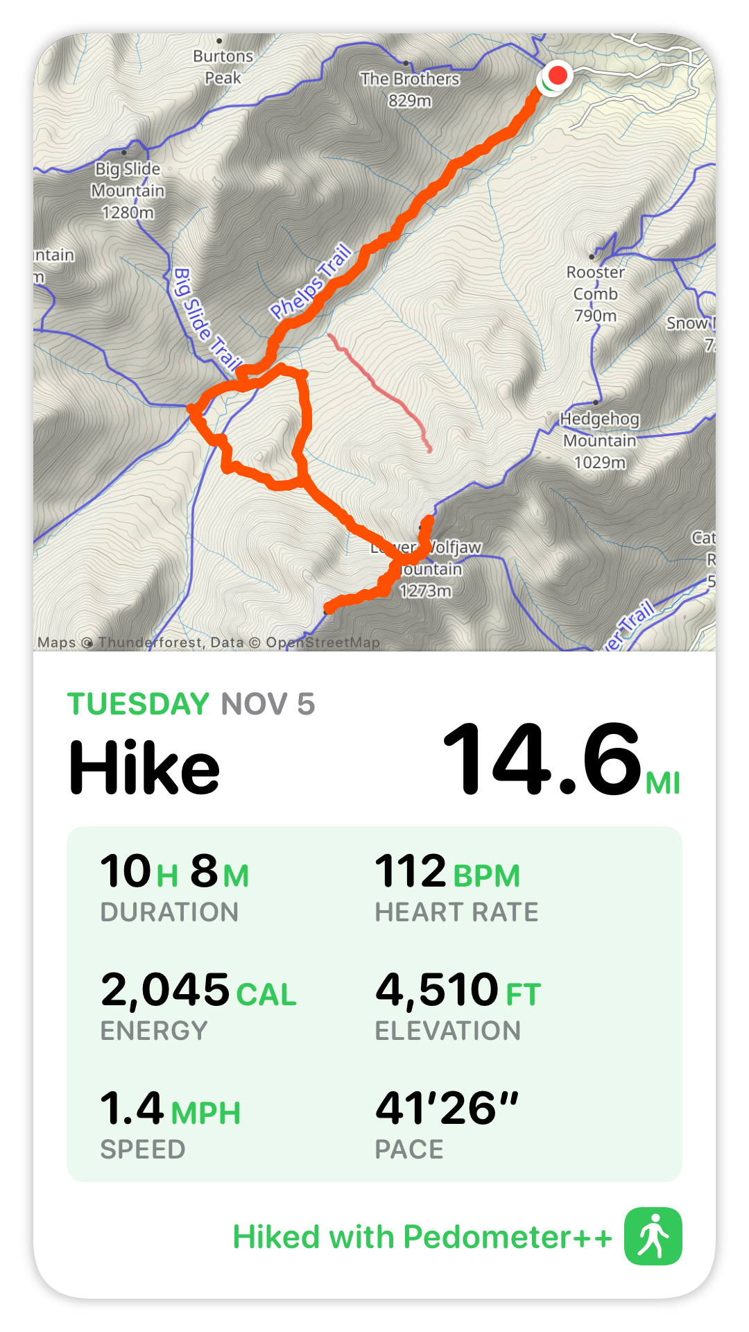
Had a lovely day out in the mountains today hiking with my first client for my own guide service. 10/10 would recommend going offline for most of Election Day. (Also, I love these new workout share cards from Pedometer++!)
So, uh, I just realized that I’ve sat down for dinner to eat my Factor meal while wearing my Mack Weldon slippers and Cortex Subtle Sweater. 🙈 I’m a good @relay@relayfm.social podcast boy?
Jason Becker: Campaigns and tactics are not the story
I think if she wins the popular vote, but loses the electoral college, it will be about how our system doesn’t work when we have partisan, geographic sorting.
If she loses outright, it will be about how we failed to convey the danger of Trump. It will be about how we have lost a shared notion of truth. It will be about how we’ve lost a common information architecture and with it, our common reality.
Well said.
Same 😬
I thought I could handle the Live Activity thing from Apple News. I can’t. Bailing at 0-0.
Oh no! 😧 @adam@social.lol what have you done!?
The anxiety multiplier. https://election.omg.lol
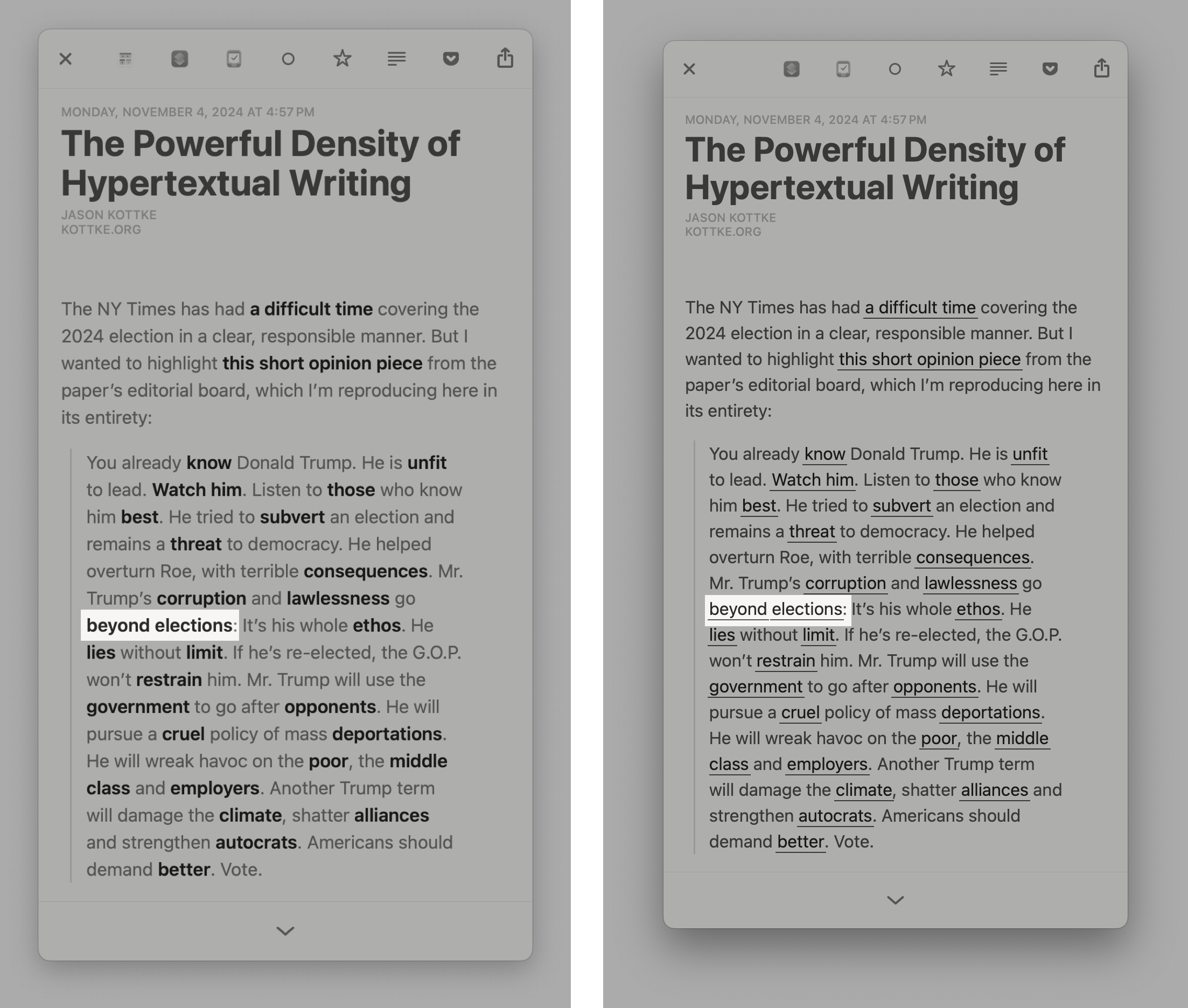
Glad to see Micro.blog praised in (a footnote of) John Gruber’s post about the art of hypertext:
Mastodon technically allows web-style hyperlinks on words, but few instances support it, and thus almost no client apps support it in their editors for writing posts. Micro.blog is an exception.
It’s one of my very favorite features of Micro.blog that I can make social network posts (they’re just blog posts!) with hyperlinks, and I hope more clients will support it.
I did some redecorating for the occasion!
But now I’ve really got to go to bed because—what’s that?—oh yes, I have my very first client hike for Onward Mountain Guides tomorrow! 😁
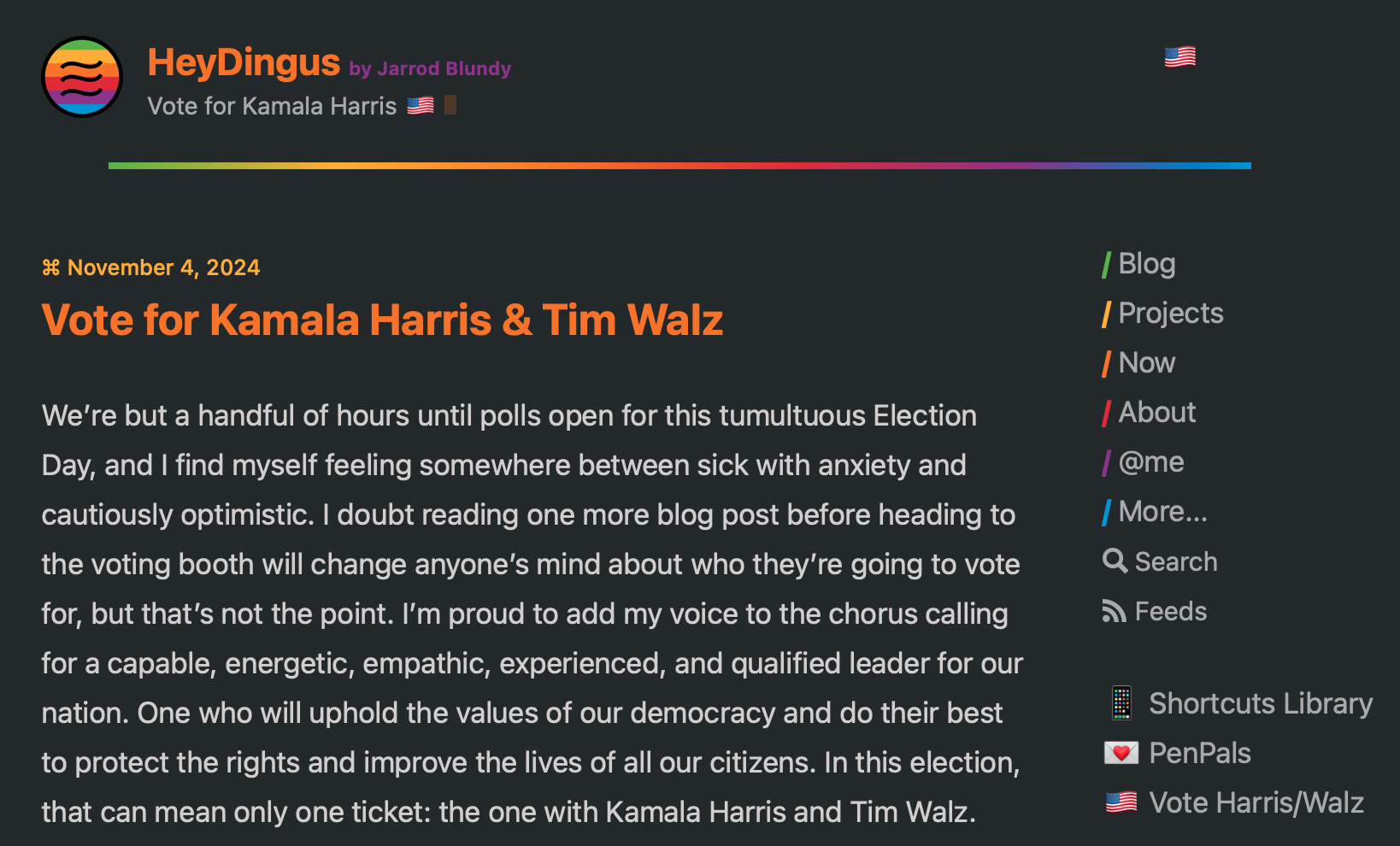
🆕📝 Vote for Kamala Harris & Tim Walz
Kamala is the only choice—but also the right choice—for our free and democratic values, and basic human rights, to be upheld. And it's well past time that we ask a woman to lead us. 🇺🇸
This has me rethinking some things on my lock screen…
Always enjoy reading @nashp and I like this idea of the Lock Screen being the Home Screen. https://nashp.com/134
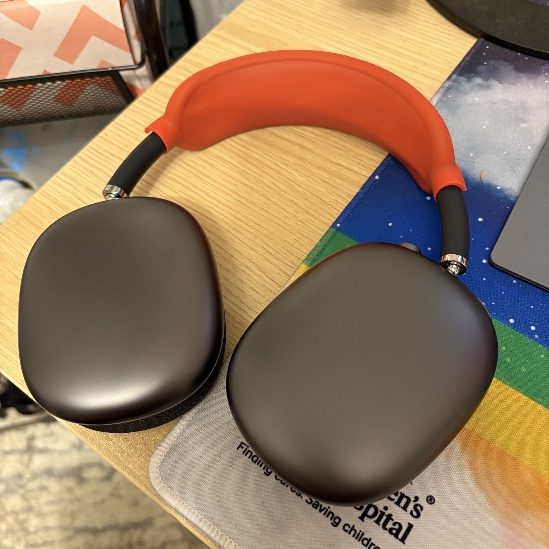
My 1-hour review of this silicone cover for AirPods Max: I was skeptical pulling it out of the package, but so far so good! It’s totally fixed my problem with the all-stretched-out headband fabric. Way more comfy again. Plus the red color pops and feels like an homage to my beloved red iPhone mini!
Wes Davis at The Verge tallies up his Apple product usage, comparing to Tim Cook’s routine:
Final count: 15 devices, nine services, 26 apps, and eight accessories.
Describing all of that made me feel like I’ve stared into the abyss only to find it staring back at me. But it still leaves out countless other Apple apps, non-Pro iPads, the iMac, and the Mac Pro. How would someone, even the CEO of Apple, fit those in?
I rarely stop to consider just how many Apple devices and services augment my daily life. It’s a high number, to be sure, but I’m not sad about it.